Purchase Option
Overview
The subscription widget block allows users to view and select a product’s selling plan.
About Purchase Options
The power of purchase options
In Shopify, the three core ingredients of any purchase option are quantity, variant ID, and selling plan ID. Together, they define exactly what a customer is buying, how much of it they’re getting, and under what purchase terms (one-time or subscription). Being able to dynamically adjust these values gives you flexibility to create tailored bundles, offer subscription discounts, or seamlessly switch product configurations without forcing the customer to reload the page.
Setup
Adding the purchase to your theme
Once a selling plan is created, navigate to your theme and add the subscription app block to your product page or a featured product section. If a selling plan has been assigned correctly to a product, the subscription widget will render all selling plans including one-time purchases.
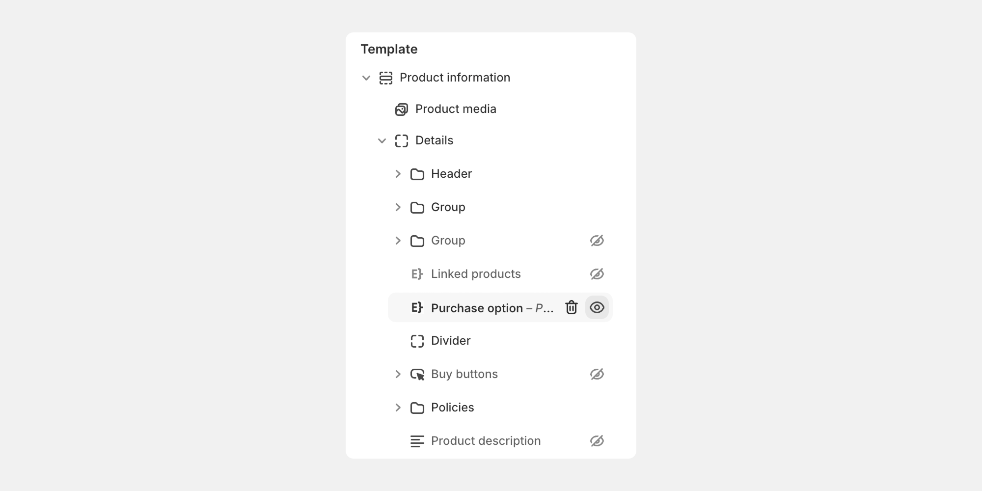
Assigning the product
After the purchase option app block is added to your theme, you'll need to assign a product you want the purchase option to add to cart.
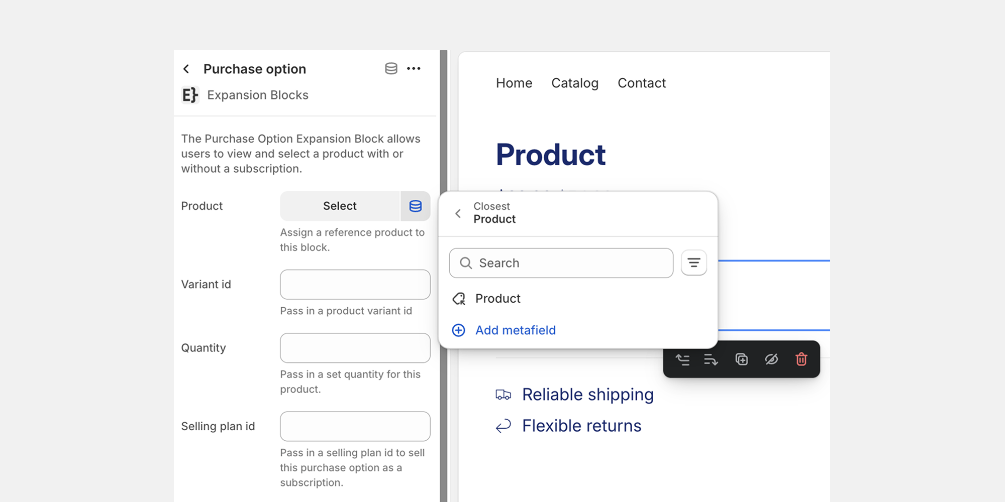
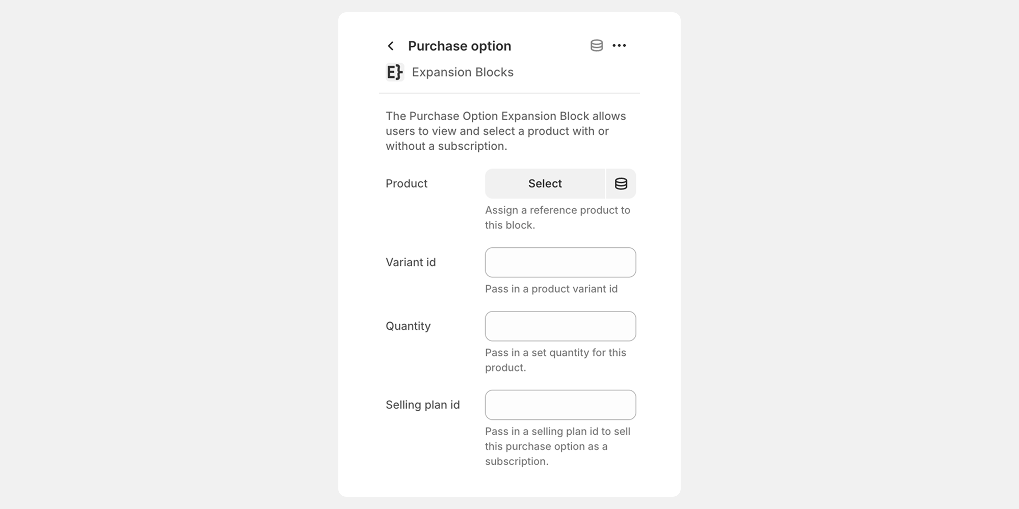
Adjusting purchase option inputs
Configure the purchase option by passing the following variables:
- variant_id – updates the product form’s selected variant.
- selling_plan_id – updates the product form’s selected selling plan.
- quantity – updates the product form’s selected quantity.
Ensure the product form’s selectors are set up to let the widget dynamically update these values when selected.
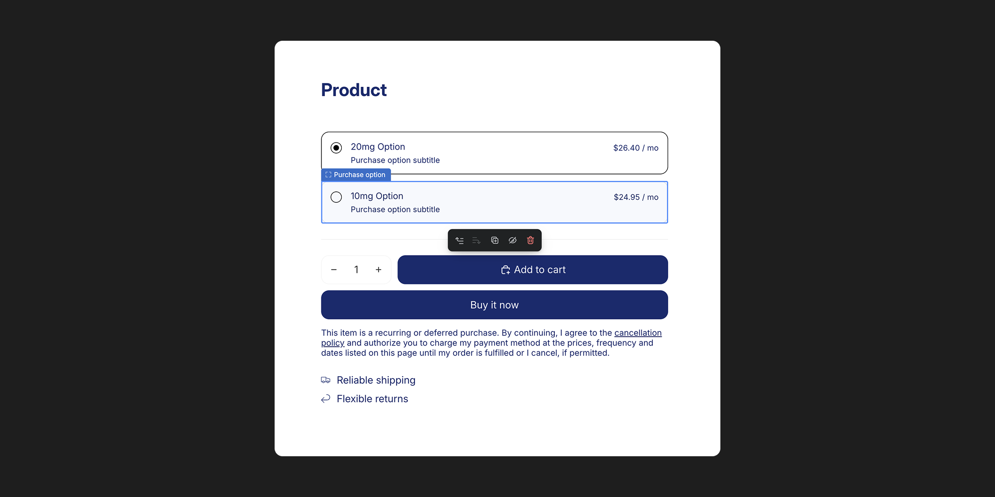
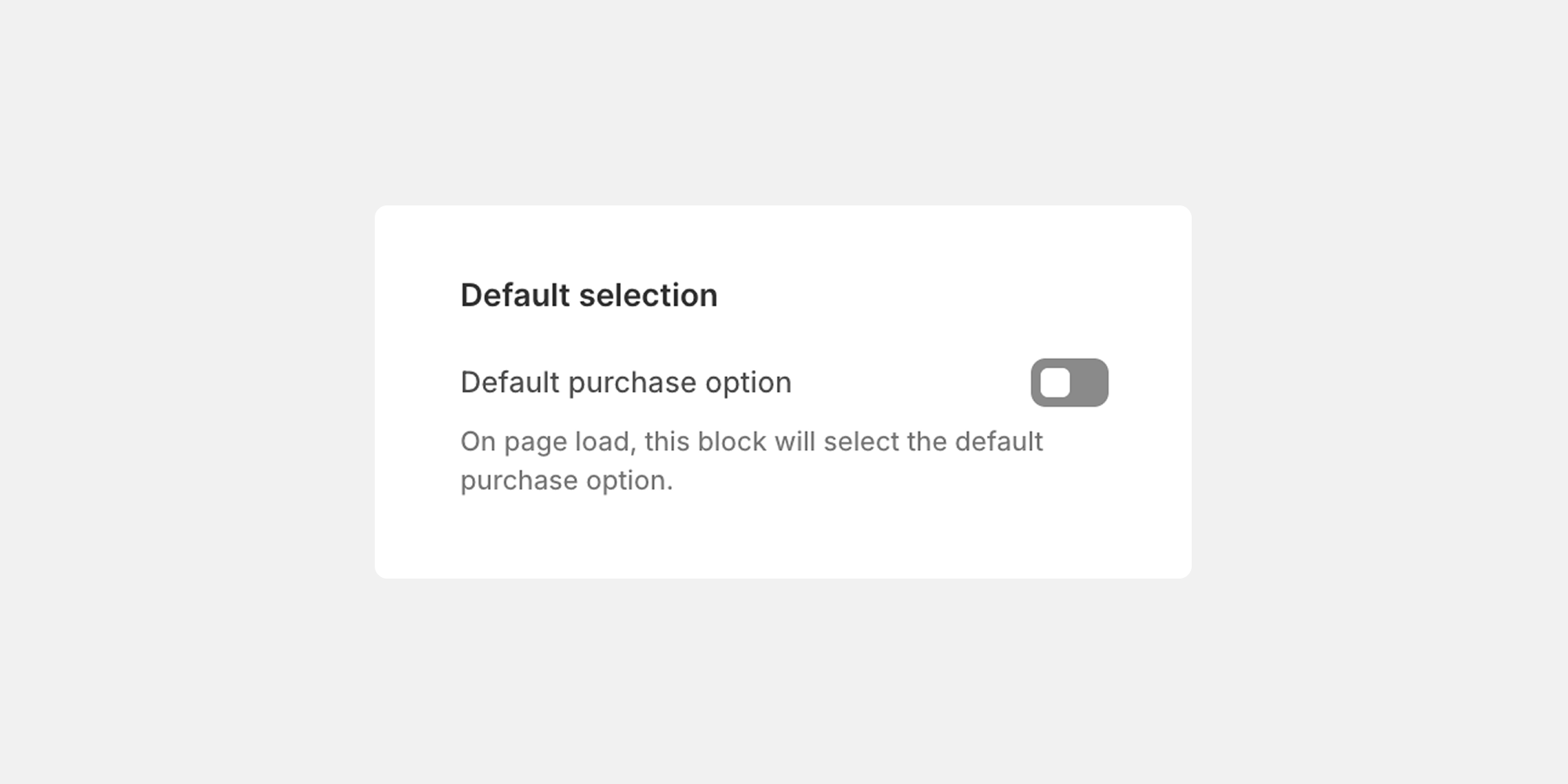
Default selection
It's best to have two or more purchase options available in a product form. By default, you'll need to choose which option is selected on page load. You can adjust the default purchase option in the app block settings.
Customizations / Styling
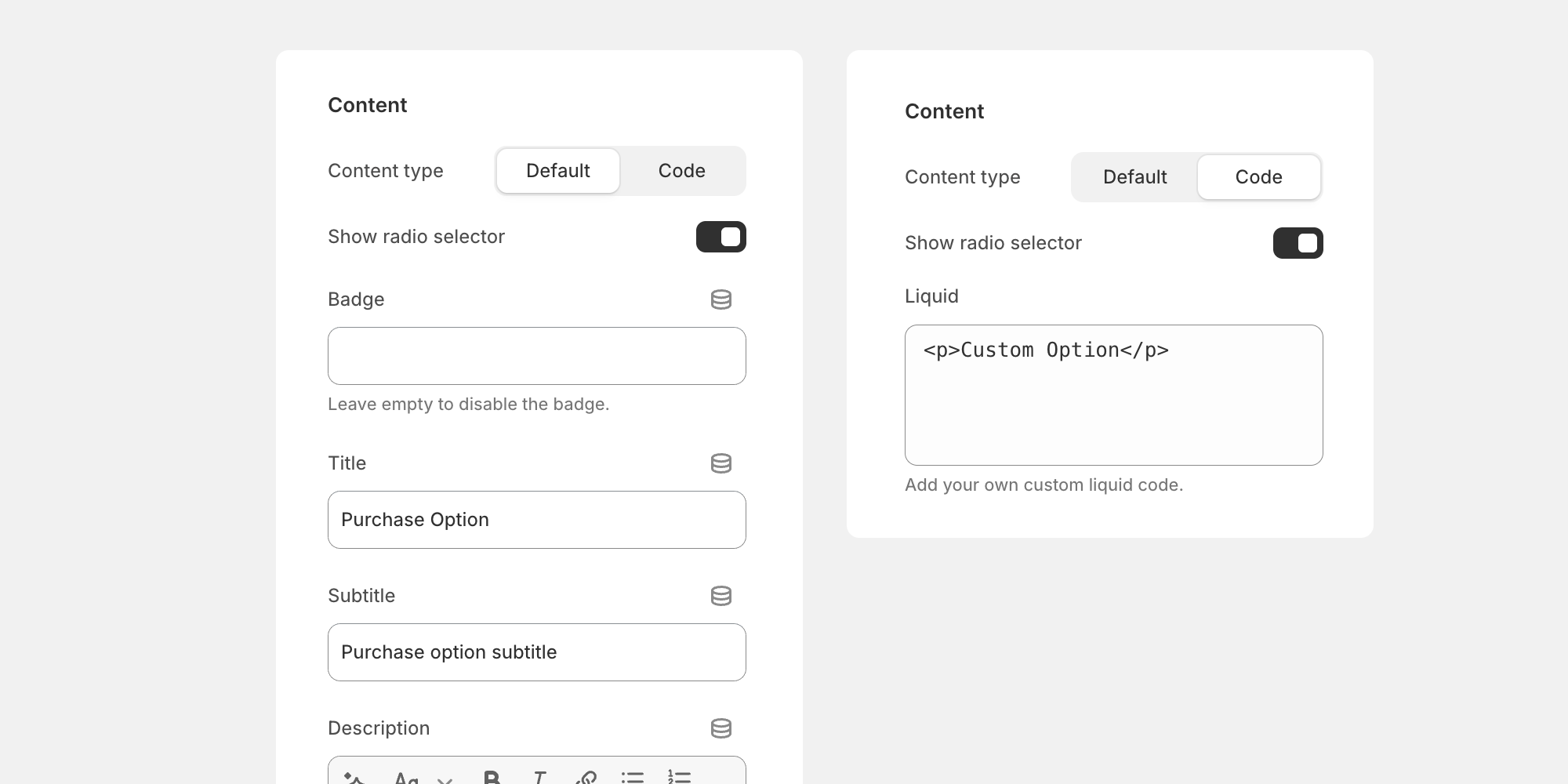
In the app block settings, you can toggle between a default content type, and a code content type. The default content type allows for a basic text based configuration whereas the code content type accepts liquid code for advanced customizations.
Default content type
In the default content type setting, you can modify the following options:
- Badge: text input
- Title: text input
- Subtitle: text input
- Description: richtext input
- Display price: default, hidden, or custom text input
- Price suffix: text input
Additionally, you could pull in metafield data to any of the default content type inputs.
Code content type
In some cases the default content type may be limiting, in the code content type you can write liquid code or render in a snippet.
Finding Product Variables
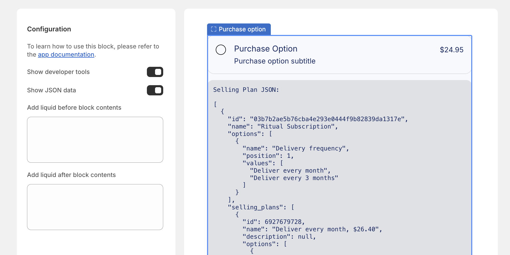
Show JSON data tool
Retreiving product variables can be tricky if you don't know where to look. We built a toggle to expose all of the product data that can be accessed under "Show developer tools" in the app block settings. Once you toggle the "Show JSON data" the different product variables will display below the widget only in the theme customizer.
Required CSS Variables
The purchase option block is designed to inherit some of the global settings in Shopify’s Horizon theme. If you are using a different theme or have customized your Horizon theme, you may need to set some CSS variable values for the default installation to display correctly. Below is a list of CSS variables that you may need to define:
:root {
    --color-variant-text
    --color-variant-background
    --color-variant-border

    --color-selected-variant-text
    --color-selected-variant-background
    --color-selected-variant-border

    --variant-picker-button-border-width
    --variant-picker-button-radius

   font-family: var(--font-paragraph--family);
   font-style: var(--font-paragraph--style);
   font-weight: var(--font-paragraph--weight);
   font-size: var(--font-paragraph--size);
   line-height: var(--font-paragraph--line-height);

   --font-size--2xs: 0.625rem;
   --font-size--xs: 0.8125rem;
   --font-size--sm: 0.875rem;
   --font-size--md: 1rem;
   --font-size--lg: 1.125rem;
   --font-size--xl: 1.25rem;
   --font-size--2xl: 1.5rem;
   --font-size--3xl: 2rem;
   --font-size--4xl: 2.5rem;
   --font-size--5xl: 3rem;
   --font-size--6xl: 3.5rem;
}